Feeds:
Posts
Comments

Archive for the ‘watercolor’ Category

I have now successfully completed the World Watercolor Month challenge of doing some kind of watercolor painting each day of July. I have had a tremendous amount of fun and improved my skills and confidence. Thank you all for your support and encouragement for my painting efforts throughout this month.

If you want to see the first four installments of my painting efforts this month, check out my previous postings ‘More fun with watercolor‘, ‘World Watercolor Month 2020—part 2 ,’ ‘World Watercolor Month 2020—part 3,’ and Word Watercolor Month—part 4. This final installment highlights my painting efforts over the past nine days in reverse chronological order.

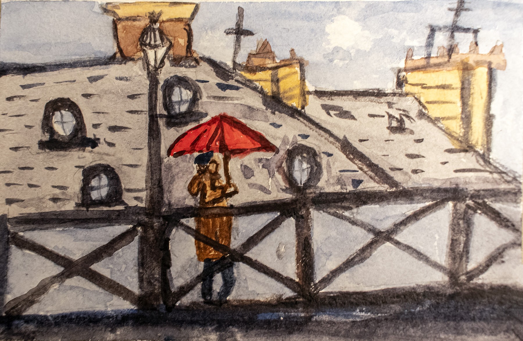
Day 31 and the prompt was “do-over,” so I had another go at painting a scene that I painted last November while in Paris of a lady with a red umbrella crossing a pedestrian bridge over the Seine that I had photographed. Here is a link to the postingPlaying with watercolor in Paris‘ that shows the November version of the painting, and a link to the post ‘A few more umbrellas in Paris‘ that shows the photo on which the paintings were based.

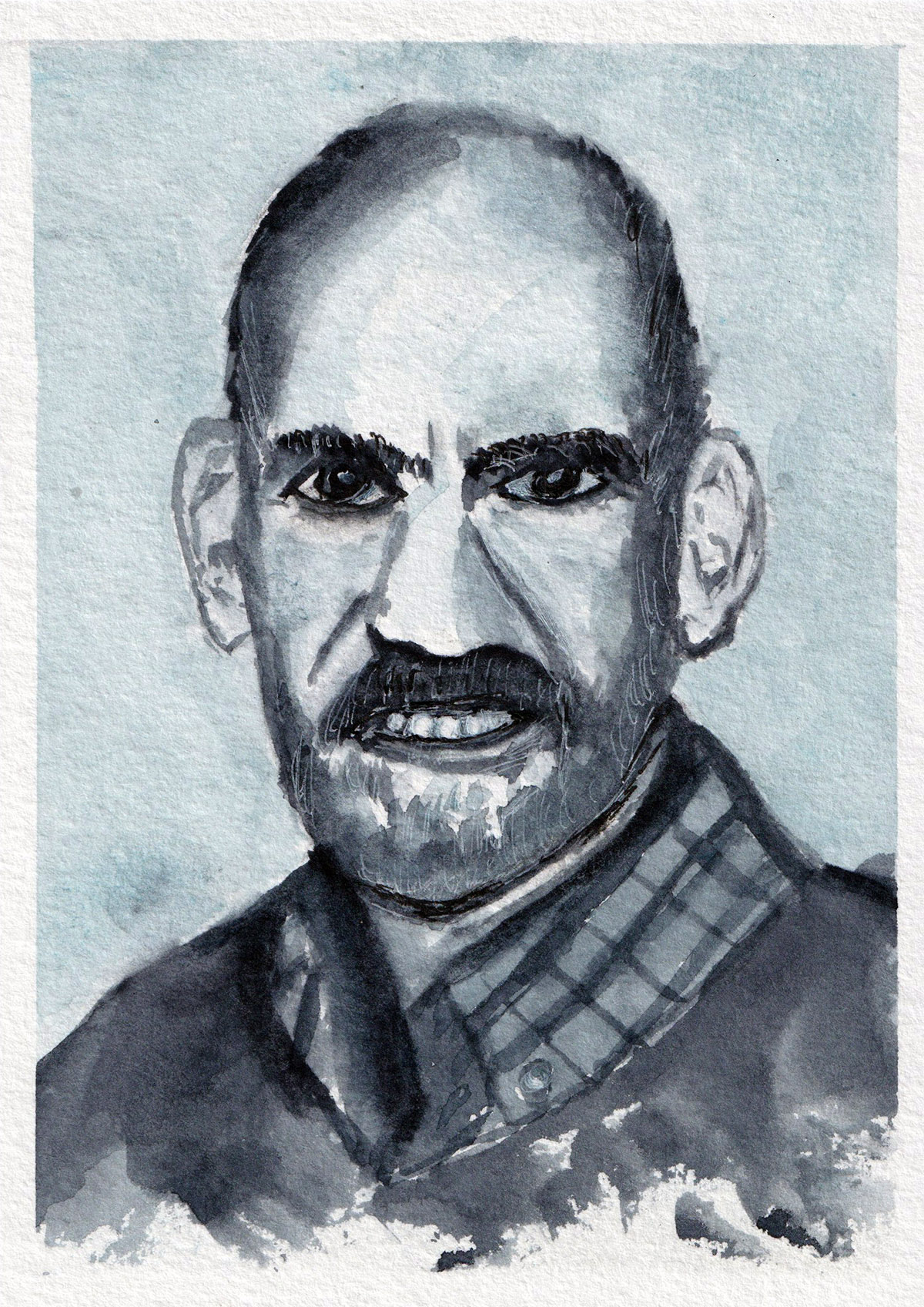
Day 30 and the prompt was “pose.” I decided to be my own model and painted a version of the photo that has been my profile image for a while. Thanks to my friend, Cindy Dyer, for taking such a good photo of me.

Day 29 and the prompt was “yesterday.” Immediately thinking of the Beatle song by that name, I was flooded with memories of growing up in the 1960’s, so I did a colorful little painting reminiscent of a tie-dyed t-shirt as a kind of homage to that period in my life.

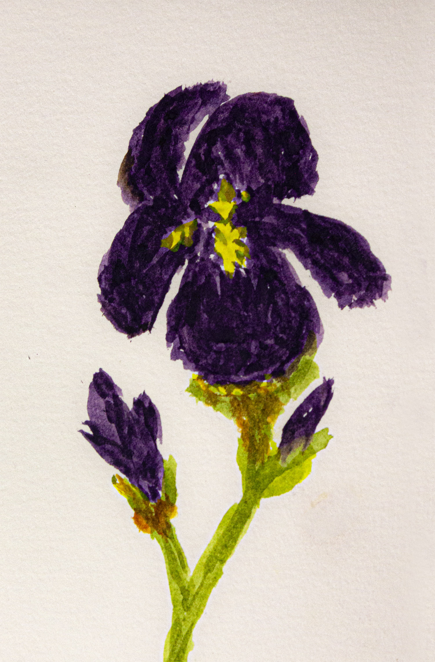
Day 28 and the prompt was “complementary.” Purple and yellow are complementary colors, so I decided to paint a field of imaginary wildflowers in those colors. I made no attempt at realism or nuance in the painting—I just wanted to play with the paint.

Day 27 and the prompt was “shine,” so I painted a little landscape with the moon shining down on a grove of shadowy trees.

Day 26 and the prompt was “favorite song.”  I remembered that one of my parents’ favorite hymns was “His Eye is on the Sparrow,” so I painted a little sparrow. The final line of the wonderful hymn is, “His eye is on the sparrow and I know He watches me.”

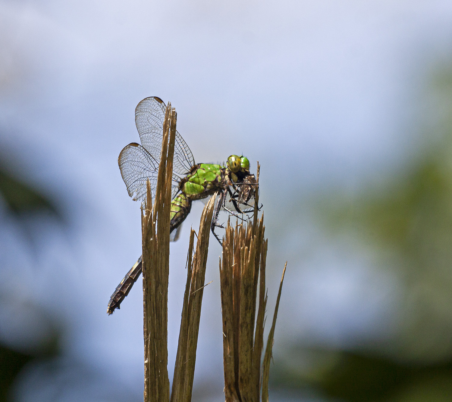
Day 25 and the prompt was “sharp.”  I decided to paint a version of a photo I had previously taken of a dragonfly that had chosen a precarious perch on a thorny vine.

Day 24 and the prompt was “abundance,” so I did a tiny painting (3×3 in/76 x 76 mm) of a field full of bright red poppies following a YouTube tutorial by Ellen Crimi-Trent (https://www.youtube.com/watch?v=IUDC7Aojxm4&t=83s). It’s fun to paint something so small, where details are only suggested.

Day 23 and the prompt was “alone,” so I painted a solitary bird perched amidst some blossoms. It kind of looks like a cross between a chickadee and an American Robin. I later learned that the bird looks to be a Varied Tit, a bird found in the Far East. I had loosely followed a YouTube tutorial that did not identify the bird  (https://www.youtube.com/watch?v=BtlLzgfnQxw&t=1222s).

I plan to continue with my watercolor painting, having seen that frequent practice really helps, but it will probably be a while before I post any paintings here on the blog. Thanks again for your support and indulgence as I have veered off my normal creative path.

We should be back to my regularly scheduled nature photography, though you have probably noticed that the photography continued without any discernible pause in July.

Paris Umbrella

self portrait

tie dye

wildflowers

shine

sparrow

dragonfly

poppy field

Variable Tit

© Michael Q. Powell. All rights reserved.


Read Full Post »

July is World Watercolor Month, a month-long challenge in which watercolor painters of all ages and skill levels are encouraged to paint daily and post their work on-line. I have joined this challenge and am trying to paint something every day using the daily prompts at worldwatercolormonth.com. So far, I have managed to paint something every single day, generally following the daily prompt. Thanks to all of you for your support and encouragement as I have taken this little artistic detour on my photography journey.

If you want to see the first three installments of my painting efforts this month, check out my previous postings ‘More fun with watercolor‘, ‘World Watercolor Month 2020—part 2 ,’ and World Watercolor Month 2020—part 3.’ This fourth installment highlights my painting efforts of the past six days in reverse chronological order.

The prompt for 22 July was “valuable.” I decided to depict nature in a landscape done entirely in Payne’s Gray, because during this time of quarantine, nature has been a refuge for me, of inestimable value for my peace of mind. There is no particular significance to the color—I imply liked the idea of using a single color and focusing on values.

The prompt for 21 July was “organic.” When I thought of the word organics, all I could think of was fruits, vegetables, and fertilizer, none of which I wanted to paint. Instead I painted an “organic” landscape with no man-made objects in it. As you can see, all of the objects were stylized as I experimented with a different shape and brush strokes for pine trees.

The prompt for 20 July was “wiggle.”  I decided to do a little painting of a Northern Water Snake that I photographed swimming in the shallow water of the Potomac River earlier this year. The color and pattern is not quite realistic, but I like the way that I captured the snake’s undulation.

The prompt for 19 July was “favorite scent.” I love the smell of pine trees, so I tried to paint a mountain scene with pine trees in the mist after watching a YouTube tutorial by Grant Fuller. My version seems to have an almost Asian feel to it that I really like. This is probably my favorite painting of this little group.

The prompt for 18 July was “soft.” It’s a bit of a stretch, but I like to think the two little sumi-e style birds that I painted have soft feathers on their tummies and are soft-spoken. The birds look a little cartoonish, but I like the way that they seem to be engaged in a conversation.

The prompt for 17 July was “spontaneous.” After watching some YouTube videos about painting loose landscapes, I decided to try an imaginary landscape without any reference photo. I had no idea what my result would look like and used techniques that included applying some of the paint with a palette knife, which explains the brilliant splotch of ultramarine blue in the middle of the painting. I like the colors and the feel of the painting and like to imagine that it is a lake in the crater of an inactive volcano, but you may well see something different.

As I look over these six paintings, I realize that I have used no bright colors at all—it seems that everything is blue, gray, or brown. That definitely was not intentional. Perhaps I will try to brighten things up a bit for the next installment as I push on towards the goal of trying to paint each day in July. Thanks again for your support and indulgence as I veer off my normal creative path.

If you want to learn more about World Watercolor Month, click on this link or go directly to doodlewash.com. In addition to raising awareness and interest about watercolor painting, World Watercolor Month raises support for The Dreaming Zebra Foundation, a charity providing support so that children and young adults are given an equal opportunity to explore and develop their creativity in the arts.

valuable

organic

wiggle

scent

soft

spontaneous

© Michael Q. Powell. All rights reserved.


Read Full Post »

July is World Watercolor Month, a month-long challenge in which watercolor painters of all ages and skill levels are encouraged to paint daily and post their work on-line. I have joined this challenge and am trying to paint something every day using the daily prompts at worldwatercolormonth.com. So far, I have managed to paint something every single day, generally following the daily prompt. Thanks to all of you for your support and encouragement as I have taken this little artistic detour on my photography journey.

If you want to see the first two installments of my painting efforts this month, check out my previous postings ‘More fun with watercolor‘ and ‘World Watercolor Month 2020—part 2.’ This third installment highlights my painting efforts of the past six days in reverse chronological order.

The prompt for 16 July was “machine.” I recalled an old mill with a waterwheel that I photographed in July 2012 that hinted at all kinds of machinery inside the mill building and did today’s little painting using one of my photos as inspiration. Here is a link to the original posting called ‘Stepping outside of the box.’ What I had forgotten, though, is that I had converted the images to black and white for the posting and I have no idea of the original colors of the structure, so I just made them up. My sketching skill are pretty weak still, so I printed a copy of the blog photo, rubbed a pencil on the back of it, and transferred a simplified version of it to the watercolor paper.

The prompt for 15 July was “forgotten.” Nothing came to mind, so instead I attempted to paint some Black-eyed Susans like the ones that I had seen while hunting for dragonflies earlier that day.

The prompt for 14 July was “green,” which made me think of flowers. So I painted a little patch of wildflowers, mostly by spattering paint—it turns out that it is a lot of fun to throw paint at paper in a somewhat controlled way.

The prompt for 13 July was “twisted.” Herons have such long necks that they often seem to be twisted, so I painted this little sumi-e style scene with three herons, some cattails, and a disproportionately large dragonfly.

The prompt for 12 July was “favorite place.” It is hard to represent Paris in a single image, so I chose to depict it with this view of the Eiffel Tower looking upwards from one of its “feet,” using one of my photos from last November as the the inspiration for this little painting —about 5″ x 7″ (127mm x 177mm). If you would like to see my original posting, check out ‘Eiffel Tower perspectives.’ I used the same transfer method for the sketch that I described above for 16 July.

The prompt for 11 July was “round,” so I did a little painting of a bicycle, loosely based on an artsy photo I took in Paris last November. If you would like to see my original posting, check out ‘Bicycle in Paris.”

I am experimenting with a number of different styles and subjects as I play with watercolor painting, but a few things are already clear. First, my greatest creative inspiration continues to come from my memories of Paris—three of the sixteen paintings I have completed so far were based on my experiences in the ‘La Ville Lumière’ (‘the city of light’).

Style-wise I continue to be drawn to the minimalist East Asian brush painting style known more commonly as sumi-e and have used this approach in three paintings already. Technically this is the freestyle version of sumi-e (xieyi) that tries to capture the essence of a subject in a minimum number of strokes rather than striving for a realistic representation of it. There is another more detailed sumi-e style called gongbi that I would not even attempt to imitate.

If you want to learn more about World Watercolor Month, click on this link or go directly to doodlewash.com. In addition to raising awareness and interest about watercolor painting, World Watercolor Month raises support for The Dreaming Zebra Foundation, a charity providing support so that children and young adults are given an equal opportunity to explore and develop their creativity in the arts.

watermill

black-eyed susan

spattered flowers

sumi-e heron

eiffel tower

bicycle in Paris

© Michael Q. Powell. All rights reserved.

Read Full Post »

Some of you may recall that I periodically dabble in watercolor painting. July is World Watercolor Month, a month-long challenge is which watercolor painters of all ages and skill levels are encouraged to paint daily and post their work on-line. I have joined this challenge and am trying to paint something every day using the daily prompts at worldwatercolormonth.com.

Last Sunday I posted photos of my first four little paintings in a posting called “More fun with watercolor.” The response to that posting was so overwhelmingly positive and encouraging that I feel emboldened to post a second installment, showing my efforts of the past six days in reverse chronological order.

The prompt for 10 July was “Fast” and I quickly attempted to paint this stormy beach scene using only two colors, Ultramarine Blue and BurntSienna. My inspiration came from a YouTube video lesson called Watercolor Postcard Paint-Along: Beach with Rocks and Stormy Sky. The wonderful instructor, Lynne Baur, runs a channel called Dragonfly Spirit Studio. How could I not be attracted to a channel with that name? Lynne has a PhD in mathematics, but abandoned that career track to pursue art and now is “an active participant in the “healing arts” movement, in which original artwork is used to help create a welcoming, soothing and uplifting environment in hospitals, medical clinics, wellness or fitness centers, nursing homes, and other places of health and healing.” You can learn more about her and her work at dragonflyspiritstudio.com.

The prompt for 9 July was “Fruit” and I painted some watermelon slices. The shapes are a little wonky, but I like the different colors that I was able to mix for the painting.

The prompt for 8 July was “Fall.” I did not feel inspired to paint something autumn-themed, so I went in an entirely different direction. It is a bit of a stretch, but the three downward-facing petals of an iris are called “falls,” so I struggled to paint an iris.

The prompt for 7 July was “Free” and I decided to free my inner child by using really bold color colors to create a hummingbird-like critter and stylized flowers in shapes and colors that I don’t think exist in the real world. My bird was not totally from my imagination, though, but was very loosely based on a bookmark that I had received in the mail from a wildlife conservation organization.

The prompt for 6 July was “Flow” and I decided to try to paint some Chinese goldfish in a style borrowed from sumi-e ink painting. I had watched several videos on this subject and was most inspired by a YouTube video by Henry Li of blueheronarts.com entitled “How to Paint Goldfish Step by Step with Henry Li.” I really am attracted to the idea of capturing the essence of a subject using a minimum number of strokes, but some of the brushstrokes demonstrated in the video seem to work more effectively on the thin rice paper used in Chinese painting than on my thicker watercolor paper. I may return to this subject in the future

The prompt for 5 July was “Favorite Color” and I chose Ultramarine Blue and completed my painting with only that color. My little scene with the cyclist was inspired by the design on a dishtowel that hanging from my oven door. I was feeling a bit bold that evening and began to paint the central figure without any kind of preparatory sketching. I like the overall feel of the little painting and the blue and white color combination reminds me of the designs on some of the china and pottery that I have seen during my travels in the Netherlands, Poland, Russia, and elsewhere.

I had a lot of fun producing these little paintings, mostly in a sketchbook. I am starting to feel slightly more comfortable with my materials and a little less self-conscious about what I am doing. I think that all of us need some kind of creative outlet. Even though I am comfortable expressing myself with my words and photography, it is good, I think, for me to deliberately make myself uncomfortable by trying something new from time to time, which may allow me to stretch and grow. As I stated in my previous painting posting, “There is no shame in being a beginner.”

If you want to learn more about World Watercolor Month, click on this link or go directly to doodlewash.com. In addition to raising awareness and interest about watercolor painting, World Watercolor Month raises support for The Dreaming Zebra Foundation, a charity providing support so that children and young adults are given an equal opportunity to explore and develop their creativity in the arts.

Fast

Fruit

Fall

Free

Flow

Favorite Color


© Michael Q. Powell. All rights reserved.


Read Full Post »

July is World Watercolor Month. I was inspired by that celebration two years ago and, after gathering a bunch of supplies, I finally put brush to paper and made my first little watercolor paintings. They were not very good, but the experience was a lot of fun and I documented it in a posting called Jumping into Watercolor. I produced a few more small paintings during the summer of 2018, but somehow my interest waned.

I spent three weeks last November in Paris and brought along some art materials. Paris reignited my desire to play with watercolor and I was inspired enough to produce some more little paintings that you can see in the posting Playing with watercolor in Paris. My skill level had improved marginally and I eventually painted a few more times before I left Paris.

Alas, I did not continue with watercolors, although I kept buying supplies and watching lots of YouTube videos. A few days ago, I downloaded the list of daily prompts for World Watercolor Month and decided I would try to paint something on as many days as I could this July. I chose to paint in a relatively small watercolor journal that is 5.5 x 8 inches (14 X 20 cm) so I would not feel intimidated by a big sheet of blank paper.

So here are my paintings for the first four days of July in reverse order. The prompt for 4 July was “Quiet” and as I though about it, my mind transported me back to an early morning last November when I watched the sun rise slowly over the Seine River.

The prompt for 3 July was “Playful” and I chose to reprise a painting style and subject that I had used once before. I used a style based on Chinese ink painting (sumi-e) that emphasizes using a minimum number of strokes to capture the essence of the subject, in this cases some frogs and dragonflies.

The prompt for 2 July was “Texture” and I decided to try to paint a wart-covered toad that I had photographed earlier this year. The prompt for 1 July was “Rejoice” and I painted a chubby little bird that was singing.

It is both rewarding and humbling to post these paintings. I feel like a little kid who is excited about producing something with his own hands and this posting serves as a virtual refrigerator door on which I can display my art. Of course I realize that my current skill level is pretty low, but was one video that I watched recently emphasized, “there is no shame in being a beginner.”

I am confident that if I can carve out some time each day to paint this month, I am sure to improve. Most importantly, I am having fun. I was chatting recently with a friend who is an accomplished watercolor artist. She confessed it is a little tougher for her to have fun, because she is a perfectionist. As our skill levels increase in any area, I think there is a danger that we may lose our initial sense of joy and wonder. I consciously try to remain on guard against that danger when it comes to my photography.

If you want to learn more about World Watercolor Month, click on this link or go directly to doodlewash.com. In addition to raising awareness and interest about watercolor painting, World Watercolor Month raises support for The Dreaming Zebra Foundation, a charity providing support so that children and young adults are given an equal opportunity to explore and develop their creativity in the arts.


Quiet

Playful

Texture

Rejoice

© Michael Q. Powell. All rights reserved.


Read Full Post »

I knew that doing a painting of Notre Dame de Paris is well beyond my current skill level with watercolors, but I decided this evening that I had to give it a try before I leave this beautiful city tomorrow. I just got done with my little painting using DaVinci watercolors on Fabriano Artistico paper and it is 5×7 inches in size (13×18 cm).

I won’t bore you will all of the reasons why this is a tough subject, but I chose the front view, which made things a little easier and I ended up simplifying a lot of details. The paper is not really flat at the moment, which means the photo I took looks a little warped, but I think you can see well enough what I accomplished.

All in all, I’m pretty happy with the results. I may give it another go from home, but it is recognizable, I think as Notre Dame—I especially thrilled that I completed this while I was still in Paris.

In case you are curious, I based it roughly on a photo that I took today that is included after the painting.


Notre Dame de Paris

Notre Dame de Paris

© Michael Q. Powell. All rights reserved.

Read Full Post »

How comfortable are you in doing something that you know you are not good at and then publicly showing the results? I have tried watercolors a few time and brought some watercolor stuff with me to Paris. My trip is over half over, so I decided last night to play a bit, using some of my recent photos for reference. I definitely need lots of practice, but it was incredibly enjoyable.

I think “primitive” would a positive spin on my watercolor “style”.  I’m finding water control and brush control to be my biggest challenges at the moment. Those two issues make it hard for me to put in details, because the lines expand really quickly if there is too much water. Of course, it helps to be able to draw, which I don’t do well, so proportions can quickly get skewed.

Here are a few geeky details for those of you who paint with watercolors. I used a twelve color DaVinci full pan watercolor set in a metal tin. DaVinci is a small company in California that makes its own paints and they are a higher quality than the student grade paints I have used before. For paper, I used several brands, but they are all 140 lbs (300 gsm) in weight and are cold press. The first painting was done on a 4×6 inch (10×15 cm) Fluid 100 block that is 100% cotton; the second one on a 5×7 inch (12×18 cm) Fabriano Artistico extra white block that is also 100% cotton; and the final one on a 4×6 inch (10×15 cm) Strathmore postcard that is made of wood pulp.

As I worked and played with the watercolors, I thought of a Sidney Sheldon quotation that I came across recently, “A blank piece of paper is God’s way of telling us how hard it is to be God.” There is something really special about the creative process, making something with your own hands.

Later today I am going on a three hour sketching tour in Montmartre, as long as the weather holds. That will be the real test for me, seeing how well I can overcome insecurities and fears while literally in public view.

Watercolor Painting in Paris

Watercolor Painting in Paris

Watercolor Painting in Paris

© Michael Q. Powell. All rights reserved.

Read Full Post »

Place du Tertre, a small square in the center of Montmartre, is a special place where artists of all varieties set up their easels every day and work in the open air, surrounded by the milling public. Many of them are portrait artists, who gently try to convince you to sit for a portrait.

I watched several of those artists at work and they are amazing talented, creating true-to-life drawings over an extended period of time. This is in sharp contrast with the large number of quick sketch “artists” who aggressively pursue you in the streets, trying to convince you to stand for a “portrait,” which is often a mere caricature that barely resembles the subject.

A number of other artists worked on small canvases with oil paint using palette knives. I had the impression that some of them were working in almost assembly line fashion, cranking out the same limited number of scenes of Paris suitable for souvenirs.

After circling the square, I returned to the only artist who was working in watercolor. He would sketch out his detailed paintings in India ink using a pointed fragment of bamboo as a drawing instrument. After the ink had dried, he would carefully apply multiple washes of color. Some of you know that I have dabbled with watercolor and I was absolutely enthralled as I watched this artist at work, mixing and applying the colors from a watercolor set not all that different than ones that I have.

Watercolor painting is time-consuming and unforgiving—you really cannot hide your mistakes. Supplies are relatively expensive, compared to oil and acrylic painting. Why would an artist choose this style of painting? It does not seem like an economically rational decision.

I did not want to interfere with the artist’s efforts, so I watched from a respectful distance and discreetly took a few photos. When he reached a certain stage when he needed to let a layer dry, he stopped for a smoke break. As he lit up an unfiltered, hand-rolled cigarette, I started to talk with him.

At first I asked him about the materials that he uses. He paints on high quality Arches 100% cotton paper, using a mix of artist quality paints from Winsor and Newton, Sennelier, and others. For brushes, he uses several rather large natural hair brushes. He pointed to one of them and noted that it had cost over 80 Euros (about $100), but he had used it for close to ten years.

He said that he had been painting from a young age and preferred painting in public like this and had done so for almost 40 years. Based on some comments he made about other painters, he seemed to reject the almost elitist idea of painting in seclusion in a studio, with works hanging in high-priced galleries.

He obviously loved what he was doing, but somewhat wistfully talked of eventually retiring to a place in the country. As he puffed on the final fragments of his cigarette, he announced that it was time to get back to work. I thanked him for talking with me—we spoke exclusively in French—and sharing his experience and perceptions. He graciously agreed to let me take a quick portrait shot and that photo, the last one below, is one of my favorite remembrances of this trip to Paris.

The first photo below gives you an overall sense of the environment at the Place du Tertre. Note the assemblage of easels and the passing tourists and compare that with the focus of the painter, who appears to be in his own little world.

The second image provides a slightly closer view of the work in progress. Note the large size of the brush that he is using and the initial delicate washes of color that he has applied.

The final shot, as noted above, is a quick portrait of the artist. It’s a candid pose from where he was standing. I really like the way that it turned out, capturing in part the unique personality of this awesome artist that I was happy to encounter, a man content with doing what he loves outdoors in all kinds of weather (except, he noted, in the rain, which obviously is bad for watercolor paintings).

Painter at Place du Tertre

Painter at Place du Tertre

Painter at Place du Tertre

© Michael Q. Powell. All rights reserved.

Read Full Post »

Eastern Pondhawk dragonflies (Erythemis simplicicollis) are voracious predators and I spotted this female pondhawk munching on another insect this past Tuesday at Occoquan Bay National Wildlife Refuge. At this time of the year the vegetation has grown high in many of the locations that I visit and I am now seeing more dragonflies perching at eye level or even higher. This heightened perspective allows me to get some cool, uncluttered backgrounds, like the one in this image that reminds me of a watercolor painting.

Eastern Pondhawk

© Michael Q. Powell. All rights reserved.

Read Full Post »

Last night I was playing again with watercolors and found inspiration in some videos about Chinese sumi-e brush painting, particularly one by Daleflix on YouTube that showed him painting a dragonfly and a frog. I really like the way that sumi-e painting, which is often done in ink on rice paper, emphasizes the importance of each brush stroke.

My painting skills still need a lot of work, but I especially like how the dragonfly turned out. There is a kind of minimalism in the dragonfly that appeals to me. It was really all-or-nothing when I painted it. Each of the wings, for example, was a single brush stroke, with a little bit of outlining done later. Similarly, the segmented body was done in a single pass.

I kind of got a little lost after I had painted the frog and the dragonfly and tried to add some contextual elements. The water ended up way too dark and some of the branches got too thick. In case you are curious, the painting is 4 x 6 inches in size (10 x 15 cm), so the brush strokes were pretty small.

Still, I like the overall feel of this little painting, which represents a new step for me as I explore watercolors. I think that I may explore this style of painting some more.

dragonfly and frog

© Michael Q. Powell. All rights reserved.

Read Full Post »

I’m a real beginner in watercolors and probably should stick to exercises and simple subjects, but that is not what I want to paint. I’ll look at some of my wildlife photos and think, “I’d like to try to paint that,” knowing full well that I don’t really have the skills to do so. I figure, though, that I’ll learn as I go along, seeing what works and doesn’t work. So yesterday evening I decided to have a go at painting an immature Cooper’s Hawk (Accipiter cooperii) that I photographed recently.

I figured the best chance I had at making something recognizable was to simplify things, especially smaller, less important elements, like the leaves in the branches surrounding the hawk. I decided that I was not going to worry about making them realistic. I also realized that it would be tough for me to capture the fine details of the feathers, so I went for a more stylized approach. I decided to simplify my color palette too and used only three colors—lemon yellow, ultramarine blue, and burnt sienna.

So what happened? You can see and judge the results yourself. Some parts of the painting came out pretty well and other parts could use a lot of improvement.

I learned a lot in the process of doing this painting, most notably that I really enjoy mixing colors. It was rare that I used one of the three colors straight out of the pan, with one exception being the yellow eye. I paid a lot of attention to trying to vary my colors, especially in areas like the feathers.

I realize now that painting details is really tough—I’m hoping that practice will help me improve my control of the brushes. The biggest thing, perhaps, that I need to work on is controlling the amount of water that is on the brush and on the paper. I was blindsided a couple of times when the result I was expecting did not happen, most often when I had too much water in my brush. (I also need a whole lot of practice with sketching.)

I didn’t really try to copy my photo, but thought you might enjoy seeing the photograph that served as a general reference for me as I painted.

Thanks to the many readers who have encouraged me to keep painting. It is a little humbling to see how crude my initial efforts are, but it really is a lot of fun creating something from scratch—there is definitely something therapeutic about playing with paints.

watercolor hawk

Cooper's Hawk

© Michael Q. Powell. All rights reserved.


Read Full Post »

Do you consider yourself to be artistic? All of my life I have been in awe of people who can draw and paint and create art, but have never considered myself to be artistic. Increasingly, though, my photography has opened up a creative side that I am trying to nurture.

As some of you know, I decided that I want to try my hand at watercolor painting and did a posting not long ago on my first efforts at doing a landscape. I don’t usually shoot landscapes with my camera, so I thought that I would try a more familiar subject for my second project—I decided to try to paint a dragonfly. In retrospect, I probably should have chosen an easier subject, but I am so inexperienced in art that I didn’t realize what I was getting myself into.

For inspiration, I used a recent photo that I took of a female Eastern Amberwing (Perithemis tenera). I have already included it in a blog posting, but am reprising it as the final photo, so you’ll know what my artistic efforts were supposed to look like.

I tried a couple of different approaches to my subject. First I tried sketching the dragonfly. I didn’t have a pencil handy, so I used a Bic ballpoint pen. My observation skills and sense of proportion are definitely lacking, but it was surprisingly fun to try. Without an eraser to correct my errors, I felt a bit like I was walking on a tightrope without a net.

Then I tried to draw with Crayola crayons? Why? I happened to be at Walmart yesterday and picked up a pack of 24 for only 50 cents at a back-to-school sale. My drawing looks a bit like a cartoon to me.

Finally I was ready to try watercolor. I decided that I would do the painting without bothering to sketch it out. Oops. I was using some inexpensive paper and it started to buckle a bit when I tried to cover the entire area with an overly wet wash of light green. I think I then attempted to put on the next layer before the first one was fully dry. I still feel like a second-grader in my watercolor skills, but it still was enjoyable trying to see what worked and what didn’t.

I did my final attempt in a sketchbook that is not intended for watercolor. I sketched out the dragonfly with a mechanical pencil and then colored the sketch with my watercolor paints. Out of all of my attempts, this is the one that I like the most. I felt a bit more confident in using the paints and in some of my strokes.

So what did I learn? Most significantly I learned that it’s worth taking a risk of feeling embarrassed; that it’s ok to try something new and achieve only a limited amount of success;, and that the amount of enjoyment that I can derive from a creative pursuit is not directly tied to any specific outcome.

dragonfly sketch

dragonfly crayon drawing

#worldwatercolormonth

#worldwatercolormonth

Eastern Amberwing

© Michael Q. Powell. All rights reserved.


Read Full Post »

July is World Watercolor Month. Ever since the beginning of the year I have wanted to try watercolor painting, so this should be the perfect time. I have watched countless YouTube videos, bought all kinds of art supplies, and even purchased some books. Despite all of this, I have not been able to overcome my fears and actually put paint on paper. In my job, we sometimes talk about “the paralysis of analysis.” I have been stuck in place, unable to take my first step as I try to figure out how best to start.

I think that I am supposed to do practice exercises and learn about color mixing by swatching my paints or perhaps even take a class. I don’t really know how to sketch and probably should learn to do that first. Maybe then I would be ready.

Well, today I decided that, ready or not, I am jumping into the deep end and that I will learn about watercolor painting by actually trying it. What a novel concept!

I decided to use some pretty basic supplies—a Winsor & Newton Cotman Sketcher’s Pocket Box; some Derwent water brushes; and a little block of 4 inch by 6 inch 140 lb cold press paper by Fluid 100. For the subject, I drew inspiration from a landscape photo taken by one of my friends (who is a real painter) that depicts a little house on the prairie, with grass in the foreground and mountains in the background.

The second image below was my first attempt. Things got out of control pretty quickly and I felt like I was hurrying myself. The first image below is my second attempt and is somewhat of an improvement. I felt more comfortable and a slight bit more in control of what I was doing.

I am pretty excited to play some more soon, perhaps in a more systematic way or maybe not. I think that most of all I need to work towards letting go of my inhibitions and becoming more like a child.


#worldwatercolormonth

#worldwatercolormonth

watercolor box

watercolor paper

© Michael Q. Powell. All rights reserved.

Read Full Post »

%d bloggers like this: