I was absolutely thrilled when I spotted this Great Spangled Fritillary butterfly (Speyeria cybele) on Tuesday at Occoquan Bay National Wildlife Refuge, because it was the first one that I managed to photograph this year. Great Spangled Fritillaries are generally quite common where I live, but somehow I missed them, probably because my photography forays have been sharply limited by the corona virus restrictions.
The butterfly was gathering nectar from a flowering thistle, whose specific species I cannot identify. I initially thought that the orange of the butterfly and the pink of the flower would not work together, but the more that I look at the image, the more I like the color combination. What do you think?
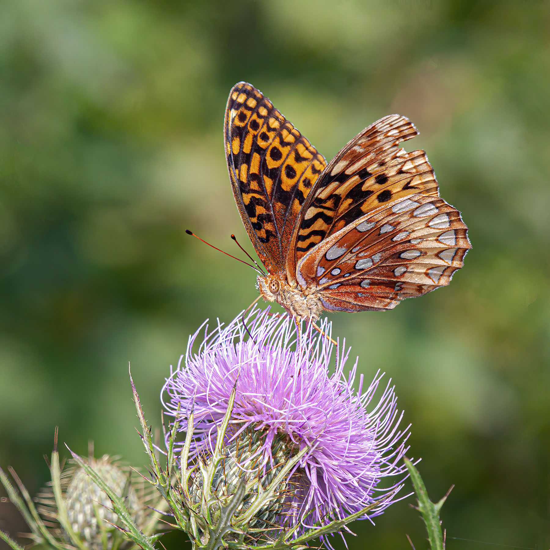
© Michael Q. Powell. All rights reserved.

I like the image a lot, Mike. Do you know what kind of flower that is? It’s very interesting.
Thanks, Dan. It is some kind of thistle, I think, Dan, though I do not know exactly what type it is.
Of course, after I posted, I realized you answered my question in the post.
And I responded to your first comment before I realized you had made this second comment. 🙂
🙂
Beautiful image
Thanks.
Perfect shot and nice colors !
Thanks. I think that almost all of my readers enjoying seeing photos of colorful butterflies. A few don’t like seeing so many dragonflies and damselflies and more than a few don’t want me to post images of spiders.
Love this one Mike. Do you ever grant permission for a watercolor isn’t to paint any of your photos?
Thanks. I am totally ok with letting a painter use my photos for inspiration or as source material. I dabble in watercolors myself, though I am not very skilled at it. The only request that I’d have is that you let me have a look at what you paint.
Thanks, Mike. I will honor your request…
Stunning, Mike M 🙂
Thanks, Martin.
Cracking shot!
Thanks. I worked a little to get the angle and the butterfly was cooperative. It’s nice when things come together like that.
I sure enjoyed this magnificent photo, Mike. The particular position of this stunning butterfly is special, as you were able to capture both the underside and the back side. I love all the geometric designs, and the colors are wonderful.
Thanks, Jet. As you know it is usually an either/or proposition with the wings and I was quite fortunate to see the outside and inside surfaces of the wings.
Gorgeous! Do you have zinnias in your flower garden? Don’t tell them pink, red, orange,yellow and white blossoms don’t go together! 🤣🤣😂
Blue Rock Horses Frederick County, Virginia bluerockhorses.com
Alas I have no flower garden on my own and have to rely on those I find in the gardens of my friends and the ones I find in the gardens and parks that I visit. When I raised the question of what colors go together well, I was thinking in a more abstract, technical sense–in color theory, complementary colors are those that are opposites on the color wheel, like, for example, blue and orange; red and green; and yellow and violet.
Who cares if the color combo works or not (although I think it does), I’m so struck by the butterfly’s eyes (spotted!) and antennae (red-tipped!) I hardly noticed anything else! Amazing photo.
Thanks, Rebecca. Nature provides its own beauty and color combinations don’t really matter. I am glad you were able to pick up on some of the wonderful details of the butterfly. 🙂
Lovely capture, Mike. One of these landed next to me yesterday and I was able to get a good close look at it. Love those silvery spangles. 🙂
Thanks, Eliza. Those spangles really make this one shine in the sunlight.
The frit and thistle are a great combination, Mike. I sometimes see these in the yard but it has been a while. Nice shot.
Thanks, Steve. I was so happy to see this one. I had been keeping an eye out for one all summer.
The contrast of colors and forms works beautifully.
Thanks, Michael. I usually think in terms of “complementary” rather than “contrast,” so I worried that the rough texture of the ground would not work as well as the green of vegetation. I guess I need to expand the range of options that I consider when shooting a subject.
Complementary and contrast can work for or against each other. There’s the fun.
The butterfly is nearly three dimensional with those colours. It jumps out of the screen! I really like the mix of pale blue, black and shades of brown… and the thistle!
Thanks, Chris. It is a simply composed photo, but I really liked how it turned out. When it has its wings fully closed or fully open, a butterfly looks kind of flat. I think the fact that the wings are partially open helps to give the image the three dimensional feel that you noted.
MAYBE I will finally catch up with your blog. Leave town and have no wifi and all disciplines that were computer related pretty much come to a stand still! I have never like pink and orange together, but this is a grand fritillary photo!
Not to worry, Molly. There are definitely benefits to unplugging periodically, whether by choice or by necessity.
MAYBE I will finally catch up with your blog. Leave town and have no wifi and all disciplines that were computer related pretty much come to a stand still! I have never like pink and orange together, but this is a grand fritillary photo!