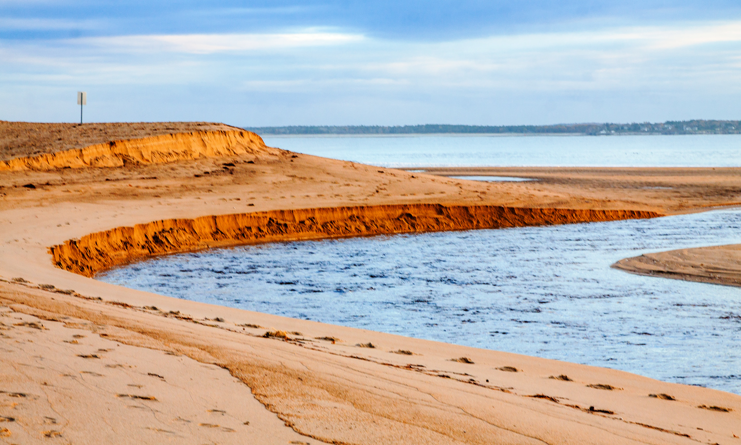
Is it distracting to have a man-made object in an otherwise natural landscape? The ocean really inspired me during my recent short trip to Maine. I am amazed at the number of beautiful images that I was able to capture. I particularly like the colors and simple composition of a shot I took of a small river that rises and falls with the tide.
As I was working on the image, I noticed that there was a solitary warning sign in the upper left-hand corner that alerts folks to the dangers of the tides. I actually like the juxtaposition of this hard vertical line with the gentle curves of the image and the hazy coastline in the background. I began to wonder, however, if others would see the sign as a discordant element in the image, so I created a second version of the image without the sign.
Which image do you prefer, the one with the sign or the one without it?

© Michael Q. Powell. All rights reserved.

Wonderful image, Mike! Sometimes manmade structures do work in a natural scene, but it depends on what it is and where it is, yet I think it is down to personal preference at the end of the day. Both images work well in their own right, but I prefer ‘no sign’, as the image is then free from distraction 🙂
Thanks, Pete. I’m beginning to see that personal preference plays a huge role in a question like this. If there were ugly power lines, virtually everyone would have been in favor of removing them. In this case, there are a range of views and I am happy so many have been willing to respond to my little question–it good to think consciously about the choices we make as a photographer throughout the entire process of producing an image.
Indeed, Mike. I couldn’t agree more 🙂
I like it best without the sign.
Thanks, Chris. Your view seems to be the majority view, though it’s nice to see that there are many different views.
Interesting that. The sign draws your eye over to it and you might miss a little of the beauty of the actual image, however, in its own way it does seem to add to the image too. What I love about both images is the colour combination, the beige and the blue, both in light tints work beautifully together.
Personally, I like the sign. It draws the eye into the picture, and if you divide the top third into thirds, it’s perfectly located. In its way the sign starts with the flow of water. Beautiful photos.
Thanks, Anne.I’m glad you joined in the discussion and I love the way you explained your choice.
I generally prefer the absence of man-made objects (especially power lines, which can be tough) but in this case, I prefer the presence of the sign.
You have mirrored my thoughts almost exactly. I have removed man-made items numerous times when I found them to be distracting. I didn’t find the sign to be distracting in this case. The interesting case was made by one reader that they would have kept the sign if it were more prominent in the composition.
Beautiful photo and I prefer the one with the sign.
My first instinct was to keep the sign. Most of those who responded like it better with the sign removed. All in all, I’m glad I did both versions.
Philosophically, I’m fairly comfortable with removing distracting elements, especially before shooting (an annoying twig or unattractive dead leaf in a forest-floor or flower macro shot, for example). I am not, however, comfortable with adding (especially Photoshopping in) elements that weren’t there when I came upon a scene. I have, on rare occasion, moved an element to a different location within the frame.
I too occasionally do a little housekeeping with a scene before I shoot to remove distracting elements, what a friend calls “hoovering.” I’ll also do some clean-up in Photoshop too. In this case, I was not bothered by the presence of the sign in the image and wanted to get others’ views. Most seem to prefer the scene with the sign removed.
Does Adobe Preview feature the tool(s) required for removing distracting elements? Or did you subscribe to Adobe CC? (You mentioned you were considering the latter.) Very unlike you to mess around with Mother Nature! As you know, I have removed distracting elements from some of my photos and am OK with it as long as nothing unrealistic is done to alter the primary subject. Long story short, I prefer the “no sign” version.
Thanks, Walter. I remove items that are clearly distracting all of the time. I hoped to spark a little discussion about the degree to which the sign was distracting and am pleased that so many have responded.
I like it best without the sign as well.
Thanks, Vicki.
I’m OK either way. The sign detracts a little, but it also adds a bit of a size reference to help put things in perspective.
Thanks, Dan. The vote seems to be trending for the one with the sign removed.
I can live with that.
I think it would work as a juxtaposition if it was a stronger element within the scene but as a background element, not in focus, I think it is best removed.
I like your explanation, Laura, and that makes sense. I was just talking with a friend who is a professional photographer, and she made a similar argument for removing the sign.
Oddly, the sign seems to add depth and a sense of scale. The photo without seems flat to me. So I like the sign even though it may be a distraction.
Thanks, Katherine. As I mentioned to others, my first instinct was to keep the sign. I like the way you articulated some reasons why it makes sense to keep the sign.
I like all the lines in the natural contours, footsteps, waterways here, Mike. But since you ask, I like the second one without the sign best–I find it more peaceful without a sign.
Thanks, Jet. I love getting feedback from others. There is such a subjective aspect to photography that it’s hard for me to know how others view different elements of my images.
The sign is mostly unobtrusive, and does serve a safety purpose, so I’m good with it.