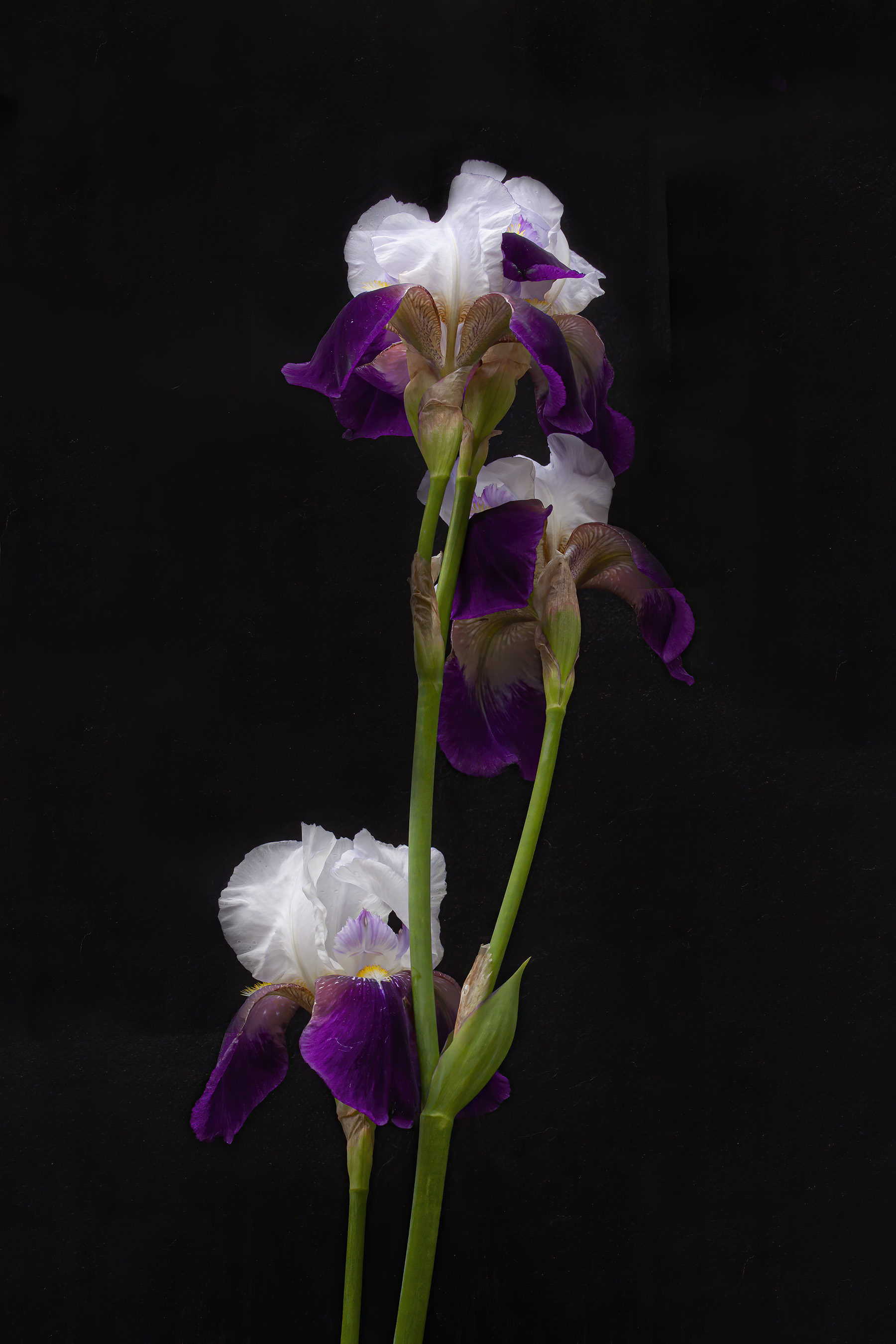
A week ago I did a posting called Studio-like irises that featured photos of bearded irises shot against a background of a white foamcore board. This week on Thursday my photography mentor Cindy Dyer and I photographed some more of the irises in her garden, this time against a black background. Cindy had obtained some black velvet-like material with an adhesive backing that she affixed to the back of the white foamcore board. Normally this material is used for jewelry displays, but it worked perfectly to highlight the forms and colors of these beautiful flowers.
Here are a few selected shots from our little photoshoot. Although we had a consistent background, we were moving in and out of the sunlight and shadows and I had to constantly change mycamera settings—we even had a few raindrops fall on us while we were taking photos. Cindy and her husband have three cats and when I opened up my images in Photoshop I learned that velvet serves as a magnet for cat hair.
If you like the look of these shots, you should check out the posting that Cindy did on her blog that features seven fabulous photos, including several colorful iris species not shown below.


© Michael Q. Powell. All rights reserved.

I’m looking at these in High Contrast Mode so my entire screen is black. Wow, that really pops. Very creative.
Those are stunning photos, Mike.
Well! You know how I feel about flowers against black. Splendid!
Nice effect!
Thanks, Martin.
Very nice!
Blue Rock Horses Frederick County, Virginia bluerockhorses.com
Outstanding with that background
Beautiful!
Awesome pics!! My Mom loves irises.
Your exposures are right on, and your exposure system seems to be working quite well for you — but I have to mention the 18% gray card again. I think you said you have one (in 5×7?); if you set your exposure on the card and lock it, you won’t have to do any adjustments as you go closer / farther away and thereby have less / more black (or white) in your frame. Or, of course, you can continue to adjust by looking at what you’ve just shot in your view screen. Just saying!
I can’t remember if I was using spot metering or matrix metering, but, as you suspected, I was making adjustments on the fly. Have you ever tried using a Passport Colorchecker? I combines a gray and white card with a series of color patches that you use to get accurate color renditions. I have looked at them and may get one to help with exposures. With flowers, I am ok with adjusting with my eye, but if/when I try to photograph people, it would help with skin tones. I am almost afraid to adjust photos of people for fear of messing up the skin colors.
Nope, haven’t heard of that, will look into it too. Lightroom and Photoshop, so far, have satisfied my color balance needs so far.
Interesting effect, Mike, with this strong contrast. I’d love to see the same irises with a white background like you tried once for comparison!
I guess, Chris, that the next time that we try this, we’ll have to shoot both versions at the same time.
Yes please! 😊
Beauty on Black, love the middle photo!
Oh the wondrous glory of creation!
Gorgeous!